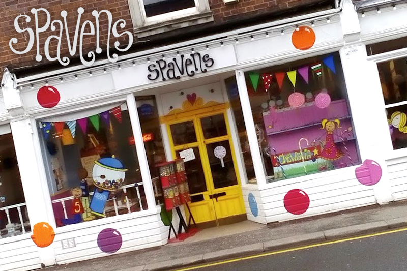
We were approached by Spavens while they were preparing their business to be offered as a franchise. Their brand was very strong locally but for Years, every menu, label, price tag, logo, menu and poster was painstakingly hand drawn and coloured by Spavens artist in residence Wendi. We needed to replicate this easily across any new stores and also make their current shop a little more streamlined and more easily duplicated.
We simplified quite a few elements they had, introducing the spots on the shopfront, the character designs in the window and simplified their logo so the Spavens name could sit with or without the gum-ball machine. We took Wendi’s hand drawn font and digitised it and rolled out the new designs to posters, menus, adverts and their website.
All in all probably one of the most fun projects we’ve ever worked on, and we always got a few free sweets to take home.


